It started with a tweet RT’d into my timeline
I thought, why not? I mean, the worst that can happen is that he says no. I’ve been meaning to learn more about data visualisation and this seems like a great way to do it.
So when Harkanwal replied almost instantly with a resounding yes, I started to get nervous. Everything I knew about data wrangling had been self-taught. I mean, don’t get me wrong, I can pivot table with the best of them… but I was miles away from the pretty visualisations in the papers.
It turned out to be one of the most useful workshops I’ve ever attended. Harkanwal went thru the history and theory of data visualisation, from good ones like this one from NYT.
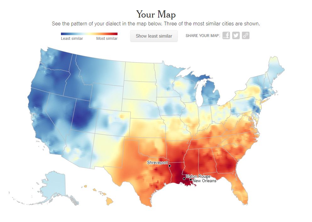
My results are below. If you’re a Kiwi reader, you should definitely do it yourself… it’s great because it’s American and I have been told I sound American… Apparently, I do, specifically from New Orleans or Baton Rouge.
There was some good advice, like to be clear what choices you are making in your visualisations. I am totally guilty of this. I let the software make decisions for me, often without thinking about it.
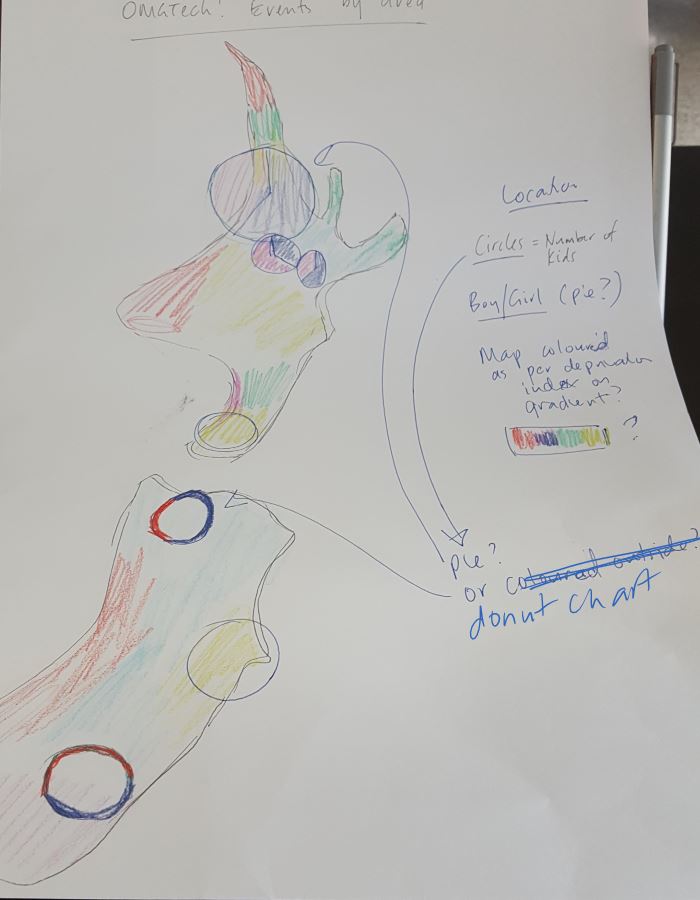
We got to do a bit of sketching. Which I had never done before. What do you think? (Be gentle, it was my first time! Also this isn’t based on actual data!
I won’t go into too much more detail, because if you are interested, you should definitely look up when he is doing another one and sign up!
Thanks Harkanwal and Elements Data Studio. Hopefully y’all will see the fruit of your labours soon!